Build More Effective Data Visualizations
Industry-renowned data visualization expert Edward Tufte once said: "The world is complex, dynamic, multidimensional; the paper is static, flat. How are we to represent the rich visual world of experience and measurement on mere flatland?" He's right: There's too much information out there for knowledge workers to effectively analyze — be they hands-on analysts, data scientists, or senior execs. More often than not, traditional tabular reports fail to paint the whole picture or, even worse, lead you to the wrong conclusion. AD&D pros should be aware that data visualization can help for a variety of reasons:
- Visual information is more powerful than any other type of sensory input. Dr. John Medina asserts that vision trumps all other senses when it comes to processing information; we are incredible at remembering pictures. Pictures are also more efficient than text alone because our brain considers each word to be a very small picture and thus takes more time to process text. When we hear a piece of information, we remember 10% of it three days later; if we add a picture, we remember 65% of it. There are multiple explanations for these phenomena, including the fact that 80% to 90% of information received by the brain comes through the eyes, and about half of your brain function is dedicated directly or indirectly to processing vision.
- We can't see patterns in numbers alone . . . Simply seeing numbers on a grid doesn't always give us the whole story — and it can even lead us to draw the wrong conclusion. Anscombe's quartet demonstrates this effectively; four groups of seemingly similar x/y coordinates reveal very different patterns when represented in a graph.
- . . . and a single visualization may not tell the whole story. Even after using data visualization to understand a pattern or to see a correlation, the numbers alone don't tell the whole story. Arranging data visualizations in a sequence to demonstrate cause and effect, journey time, strategy (such as current state, target state, or road map), and other stories can create powerful presentations that make an impact.
- It's often the only way to fit all the data points onto a single screen. Even with the smallest reasonably readable font, single line spacing, and no grid, you can't fit more than a few hundred numbers onto a screen. However, data visualization techniques allow you to fit tens of thousands of data points — a difference of several orders of magnitude — into a single figure that fits on a screen. Edward Tufte gives an example that displays more than 21,000 data points on a US map that fits onto a single screen.
- It's hard to analyze broad data sets without it. While fitting deep data sets that contain billions of rows of data onto a single screen can be challenging, various data aggregation and grouping techniques can solve this challenge. But analyzing broad data sets that contain hundreds, and often thousands, of columns is an entirely different challenge. At most, basic data visualizations can show five attributes (two axes plus the size, color, and shape of the metric) — or six if you visualize the data on a map to show location. But a pharma company analyzing typical patient characteristics in a drug trial uses thousands of attributes — physical, psychological, genetic, behavioral, etc. — and so requires different data visualization techniques.
- It "democratizes" data consumption for a wider audience. Data visualization is no longer just the realm of analysts; it helps executives, operations departments, and nontechnical business professionals like brand marketers consume insights from data analytics and make better business decisions.
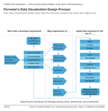
But bulding effective data visualizaitons is easier said than done. Data visualization best practices go beyond technology and involve disciplines like the psychology of visual perception and graphical design, and very few BI professionals have background and training in these subjects. While there is a plethora of academic and business books written on the subject, what busy BI professional has time to read them all. To address this challenge Forrester report Four Data Visualization Design Steps Help Turn Business Insights Into Action More Effectively introduces a practical checklist that helps BI professionals improve both business users' experience and their ability to interpret data and make better decisions.